In the first of two articles on colour, we explore just some of the psychological aspects of colour.
Our world is ablaze with colour, found in nature and people, and in the sights, sounds and smells of day-to-day life. Colours provide the bedrock and building blocks of our emotions, and are part of numerous commonplace maxims when describing different emotional states: think about ‘seeing red’ (angry), ‘feeling blue’ (sad), and ‘in the pink’ (healthy). Both consciously and unconsciously, we associate colours with cultural experiences, personal idiosyncrasies, moods and feelings.
In those early schooldays, we are typically taught about the rules and foundations of colour: how mixing equal amounts of the three primary colours—red, blue and yellow—will produce three secondary colours—orange, purple and green. We learn about warm colours, cold colours and colour combinations (depicted on a colour wheel).
As we grow and develop, we identify the colours we derive pleasure from and those we’d rather avoid. We begin to understand the many nuances of colour and how colour affects our emotions and mood. We recognise the perceived meaning of colour in clothing: the authority of black, the steadfastness of brown, the discipline of blue and the power of red. We see the influence of colours in action: the red traffic light signal commanding us to ‘stop’; a green political movement; the ‘yellow (golden) arches’ of a certain fast food behemoth, seductive and shining.

When unpicking the psychological aspects of colours, we tend to find dissimilar traits. For example:
- Red is a physical and visceral colour: one whose properties include strength and stimulation, fire and passion, energy and warmth. Too much red can appear bold, indeed overbearing. Red is the colour we see first, and is used to convey caution and danger.
- Blue is a strong and emotive colour. Regarded as an intellectual colour, blue tends to affect us mentally as opposed to physically. A serene and calming colour, blue tones can stimulate thought and promote concentration.
- Yellow is an emotional colour that buoys mood and temperament; it is optimistic, outgoing, friendly and creative. A strong colour, yellow should be used sparingly: too much yellow can give rise to fear and anxiety.
- Green is a mix of blue (intellectual) and yellow (emotional), and represents balance. A restful colour, green is easy on the eye, and promotes harmony and reassurance.
- Pink is a colour with positive virtues, from feeling rosy to reaching the pink of condition. While pink is often used to define femininity, it was once seen as a masculine colour. More and more, pink is embraced as a neutral hue, and is associated with balance. (Read more on ‘the power of pink’ in this LZF post by Tiffany Grant Riley)
- Grey is a neutral colour (other neutrals include black and white). Often mistaken as detached and unemotional, grey provides a sense of calm, its presence solid and grounding. Grey promotes stability, and a warm grey can alleviate tension and anxiety.
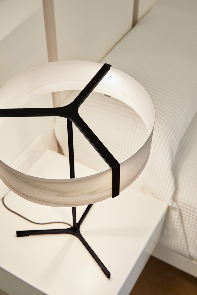
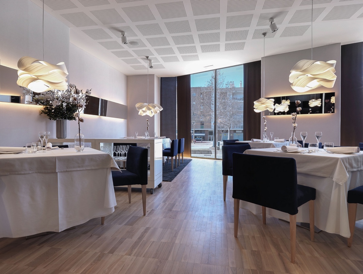
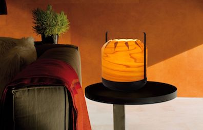
With nine coloured timber veneers, LZF has a keen understanding of the principles of colour psychology and how colour affects emotion. Honed over many years, this understanding guides LZF when choosing colours for its many lighting projects.


Text by Gerard Mc Guickin